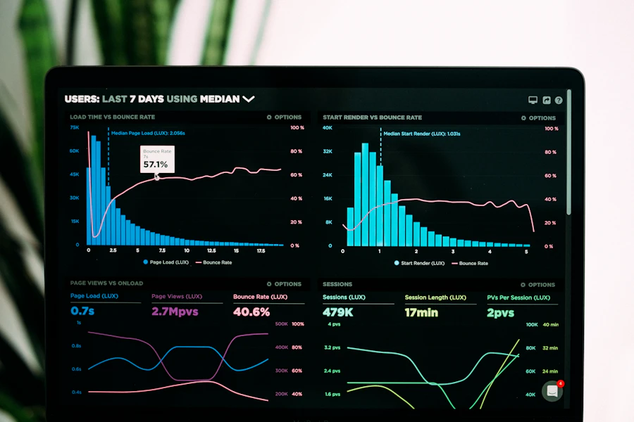
Brand identity

Identity systems that read as one brand

We design logos, type, color, and voice as a living brand book — so product UI, marketing, and sales collateral stay coherent without constant reinvention.

  • Logo lockups
  • Type & color
  • Voice principles

Brand health

What a finished system measures

Identity work is scored on consistency, accessibility, asset coverage, and voice — not on how many moodboards we produced.

Token adoption98%

UI elements bound to tokens rather than hardcoded hex values.

Contrast complianceAA+

Passes WCAG 2.1 AA contrast check across dark & light modes.

Asset coverage100%

Vector lockups and formats ready for print, web, app icons & social.

Voice consistency4.9/5

Evaluated across landing pages, error states, and pitch decks.

Color fields

Palette with roles, not decoration

Each field ships with usage share, RGB, and contrast pairs — so product and marketing pull the same ink.

Ink

#0B146411, 20, 100

Primary text & marks

  • Usage 60% UI text
  • Contrast 14.2:1 vs white

Signal Blue

#2338F035, 56, 240

Actions & emphasis

  • Usage 15% accents
  • Contrast 4.6:1 vs white

Deep Navy

#0C143812, 20, 56

Hero fields & night UI

  • Usage 15% dark surfaces
  • Contrast 16.1:1 vs white

Sky Wash

#F0F4FF240, 244, 255

Soft surfaces

  • Usage 5% cards/callouts
  • Contrast 12.8:1 vs ink

Studio Wash

#F5F7FA245, 247, 250

Page background

  • Usage 4% canvas
  • Contrast 13.9:1 vs ink

Paper

#FFFFFF255, 255, 255

Cards & specimens

  • Usage 1% highlights
  • Contrast 14.2:1 vs ink

Type system

Specimens that set the hierarchy

Display

Zupitrix

Weight
700
Size
48px / 1.1
Track
-0.02em
Expressive headlines · tracking tight
Title

Identity specimen

Weight
600
Size
28px / 1.25
Track
-0.01em
Section titles · product chrome
Body

Clarity over decoration. Every glyph earns its place.

Weight
400
Size
16px / 1.6
Track
normal
16–18px · 1.6 leading
Caption

LOCKUP · CLEARSPACE · MINIMUM SIZE

Weight
500
Size
13px / 1.4
Track
+0.05em
Labels · specs · microcopy

Logo lockups

Clearspace, minimum size, approved configs

Primary horizontal

Nav · docs · decks

Clearspace
1x height
Min size
120px
Default lockup with clearspace = x-height

Stacked mark

Mobile · avatars · app icon

Clearspace
1.5x height
Min size
32px
Centered stack; never squash

Monochrome

Emboss · print · dark fields

Clearspace
1x height
Min size
100px
Single-ink and reverse versions

Wordmark only

Dense UI · footers

Clearspace
0.75x height
Min size
80px
When the icon is already present nearby

In the studio

How identity work actually looks

Brand audit session with post-it notes and sketches01

Discovery & Audit

We map your existing visual touchpoints to identify friction and inconsistency.

Designer sketching logo concepts on paper02

Mark Exploration

Vectors engineered for legibility across 16px favicon up to billboards.
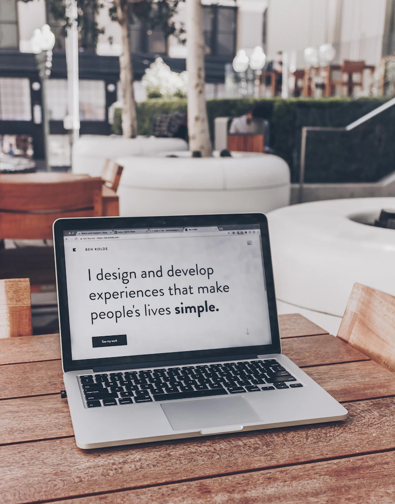
Laptop screen displaying Figma brand guidelines03

System Handoff

Figma tokens and CSS variables packaged for instant developer adoption.

Voice principles

Rewrite the line until it sounds like you

Principles become useful when you can see the before and after on real surfaces.

Hero value proposition
Avoid

We leverage cutting-edge synergetic solutions to revolutionize digital experiences.

Prefer

We design clear visual systems so your web app and marketing speak the same brand language.

Error message / Microcopy
Avoid

Error 500: Unexpected system failure occurred. Operation aborted.

Prefer

We couldn’t save your changes. Your draft is stored locally — retry in a moment.

CTA button text
Avoid

Submit Now / Click Here

Prefer

Start Brand Sprint

Applications

Identity in the wild

Dashboard product UI with design system components
01 / UI Tokens

Product UI chrome

Nav, buttons, and empty states inherit tokens — not improvised palettes.
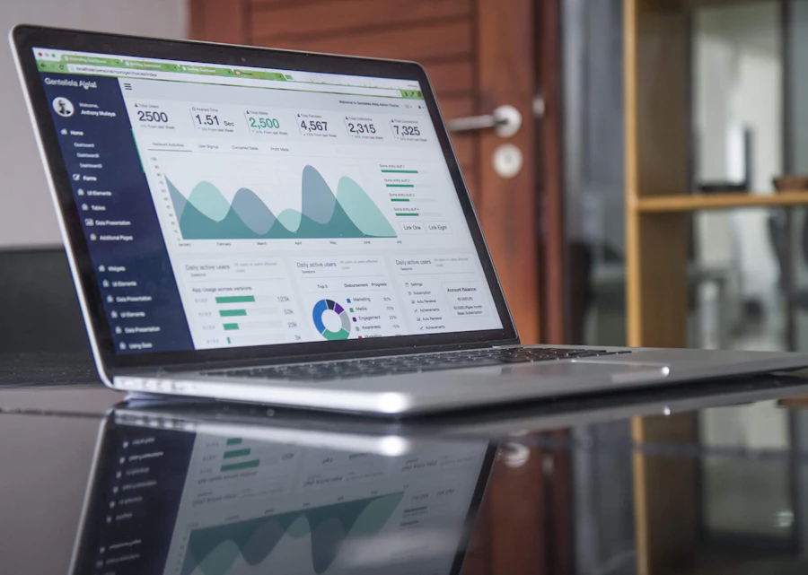
Corporate slide presentation deck
02 / Collateral

Pitch decks

Slide masters that keep the mark and type hierarchy intact under pressure.

Social media visual campaigns
03 / Campaigns

Social & ads

Crop-safe lockups and safe zones for stories, feed, and paid units.

Brand stationery and printed document templates
04 / Print

Stationery & docs

Letterhead, proposals, and PDF templates with production-ready margins.
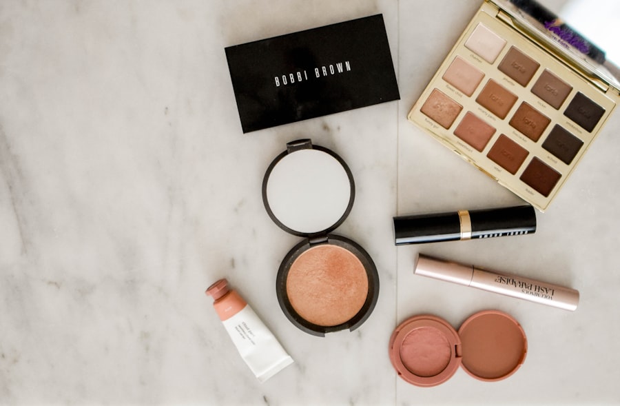
Branded merchandise packaging
05 / Merch

Packaging & merch

Simplified marks for embroidery, labels, and limited-run objects.

Deliverables kit

What lands in your hands

Formats your brand, product, and marketing teams can open on day one — no reinterpretation required.

AssetFormatsVolumeOwner
Master Logo KitSVG / EPS / PNG / PDF12 filesBrand & Product
Type Specimen & TokensFigma / CSS / JSON1 systemEngineering
Color Palette MatrixASE / Hex / RGB / Tokens6 rolesDesign & Dev
Brand Guidelines BookFigma & Interactive PDF45 pagesMarketing
Social & Deck TemplatesFigma / PPTX / Keynote15 templatesSales & Ops

Outcomes

The numbers teams feel after launch

3x

Faster UI shipping

Designers drag components from Figma; engineers use matching CSS tokens.

100%

Brand consistency

Zero rogue colors or off-brand fonts across product screens and marketing.

60%

Design QA reduced

Fewer back-and-forth reviews because token constraints are built into code.

Design team collaborating in modern studio workspace

A brand identity isn’t just a pretty mark — it’s the structural foundation for every interface, deck, and customer touchpoint your team creates.

Zupitrix Brand Studio Direction

Rollout

From mark to living system

  1. 01

    Position & audit

    Clarify audience, competitors, and equity to keep — then map where the current identity breaks.

  2. 02

    Mark exploration

    Directed concepts with rationale, not endless moodboards. Stakeholder rounds stay structured.

  3. 03

    System build

    Type, color, lockups, voice, and digital tokens assembled into a usable brand book.

  4. 04

    Apply & handoff

    Priority applications shipped first; Figma/PDF kits and usage training for your team.

FAQ

Questions about brand identity

Ready for a brand that holds up in the product?

Share your market and current assets — we will outline a specimen-first identity plan and the first deliverables worth shipping.

Start Project
Contact Us

Get In Touch

Let's build something amazing together. Contact us to discuss your project and see how we can help bring your vision to life.

New project inquiry

Start project.
We'd love to help.

Fill in the form and we'll respond within one business day — personally, not with a template.

Your info stays private